First grade city branding
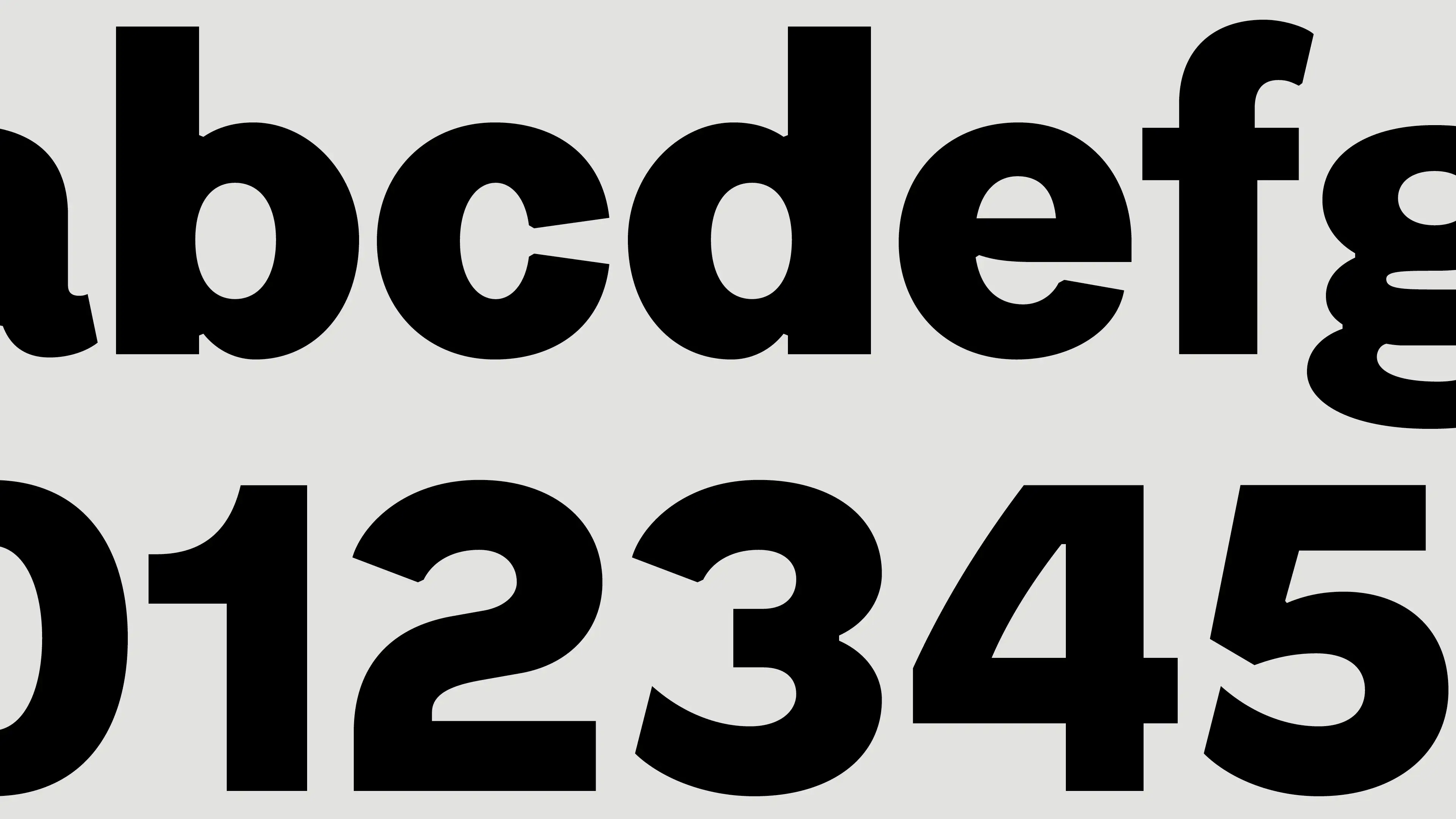
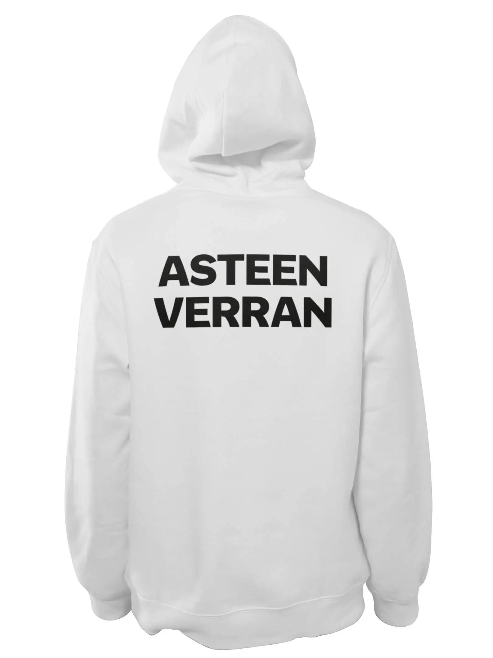
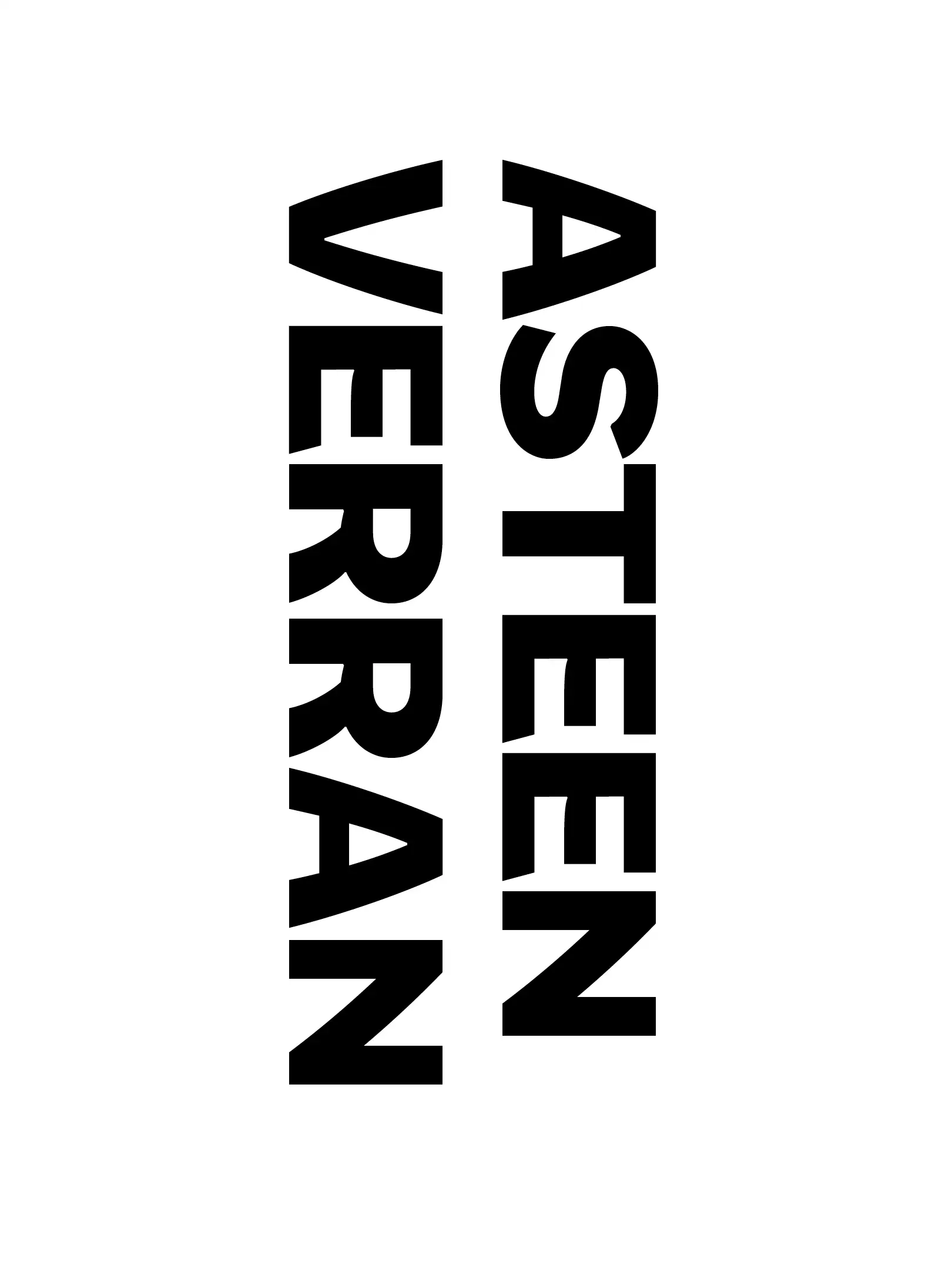
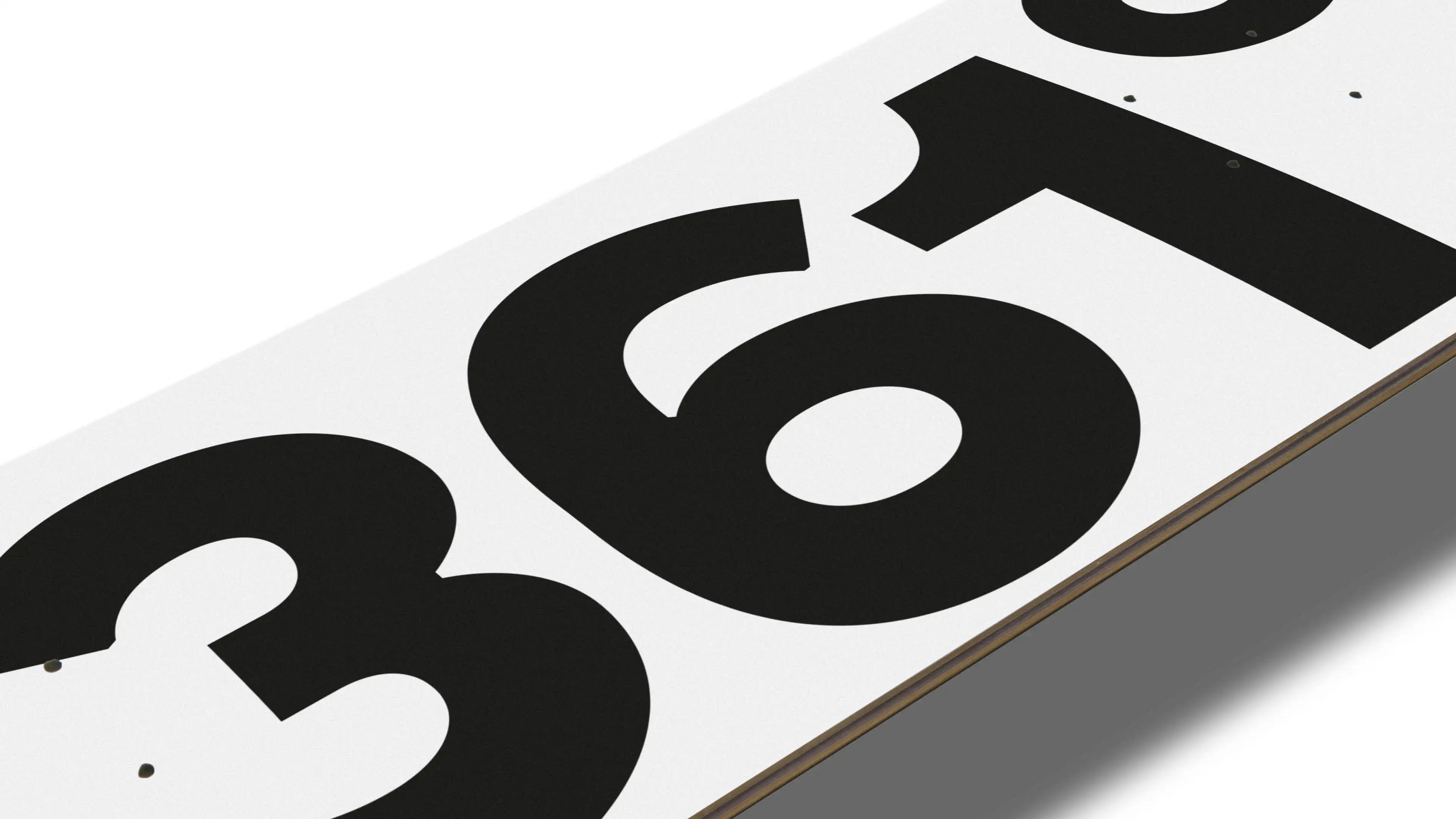
The city of Oulu redesigned its brand in collaboration with creative agency Luova Työmaa. We were asked to design a font for the people of Oulu, named Graadi, which has a slightly more relaxed character. The font features subtle variations in line thickness and slanted letter endings, similar to the Oulu’s Logo.
Type Design
Niklas Ekholm, Juho Hiilivirta, Jaakko Suomalainen
Niklas Ekholm, Juho Hiilivirta, Jaakko Suomalainen
Branding Agency
Luova Työmaa
Luova Työmaa
Client
Oulun kaupunki
Oulun kaupunki
Photography
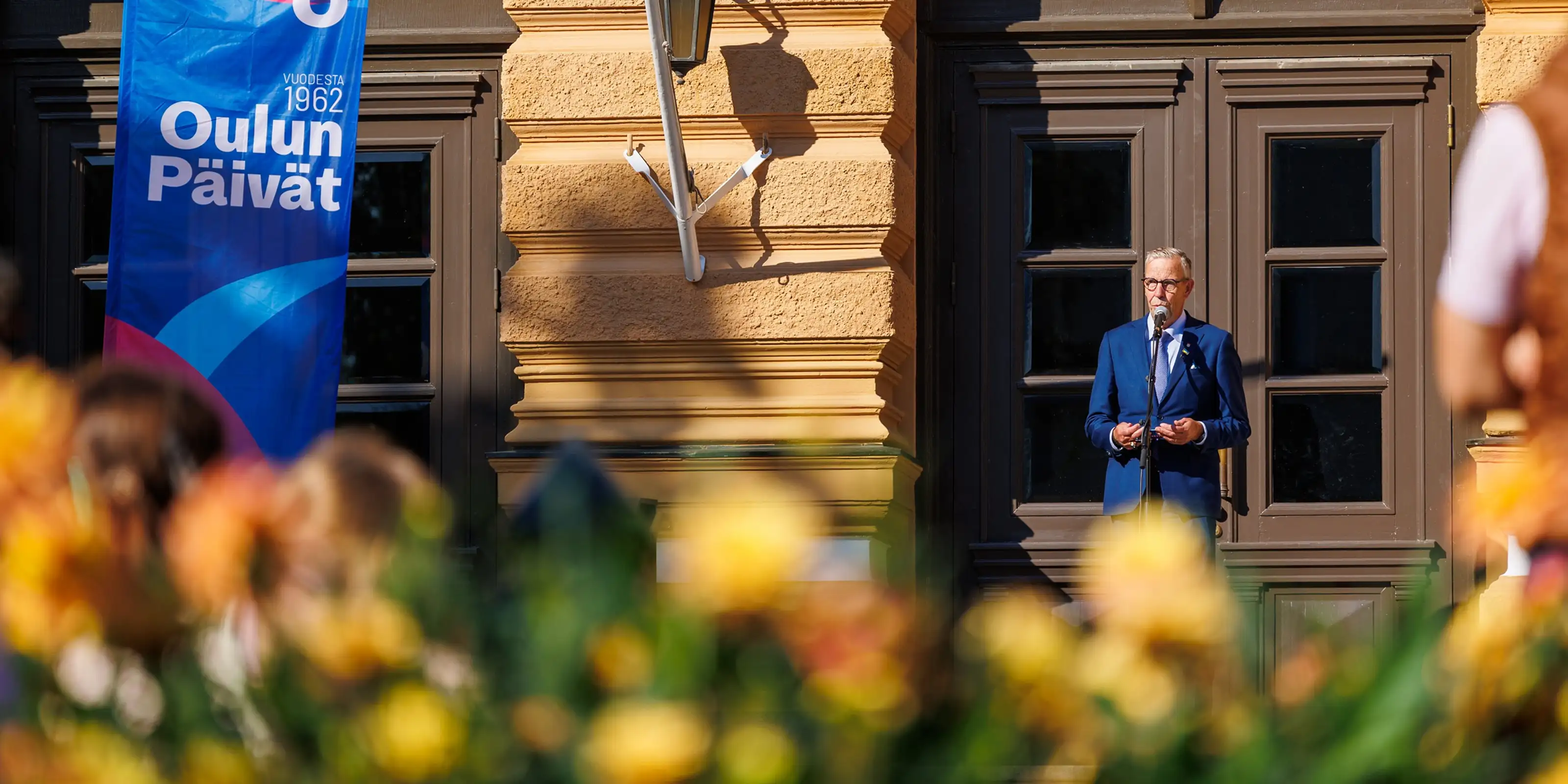
Courtesy of Oulu
Courtesy of Oulu
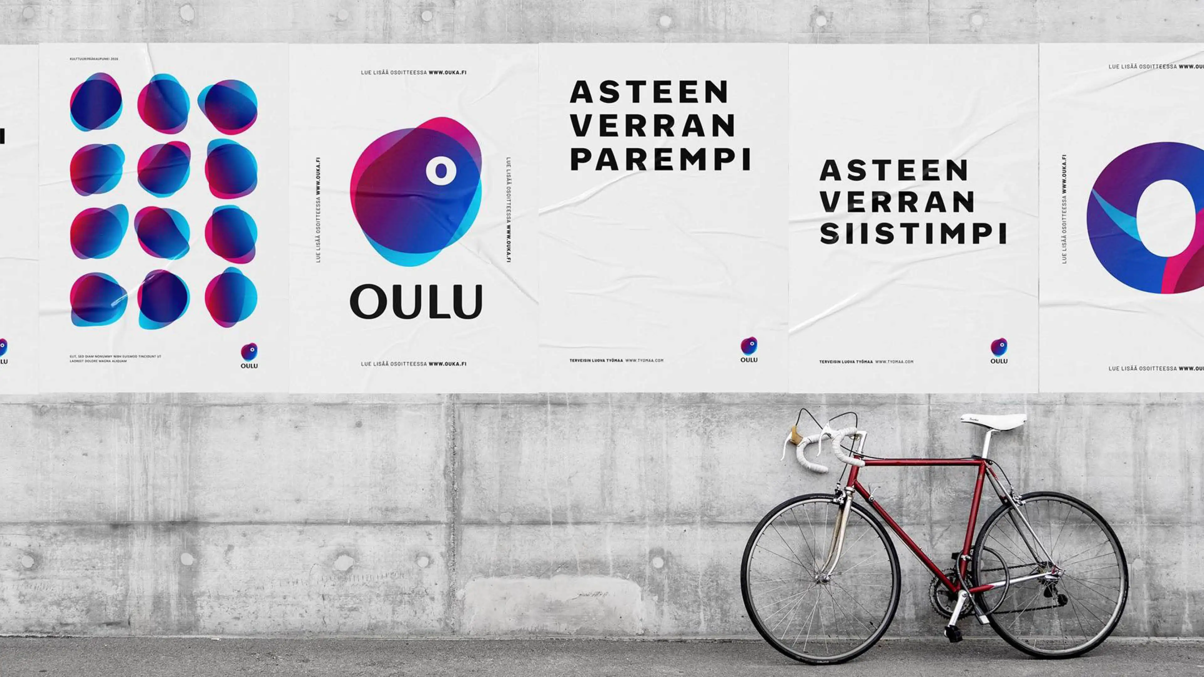
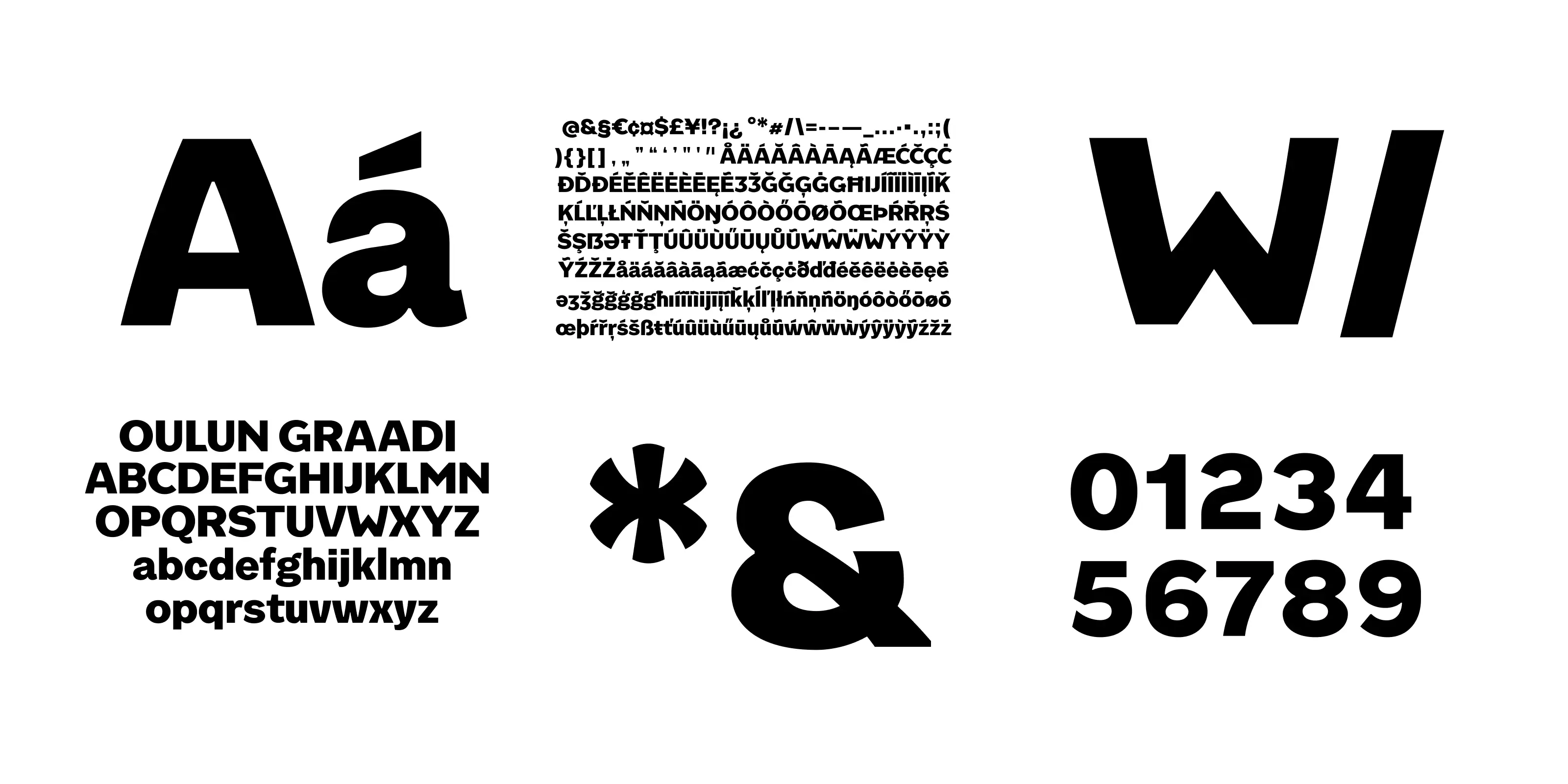
Instead of sharp diagonals, it has gentle arcs, and its tightest inner corners open up into a slight smile—like a friendly nod in passing. The font’s unique shapes feel warm, ample, and humanistic, giving it a welcoming and approachable character.
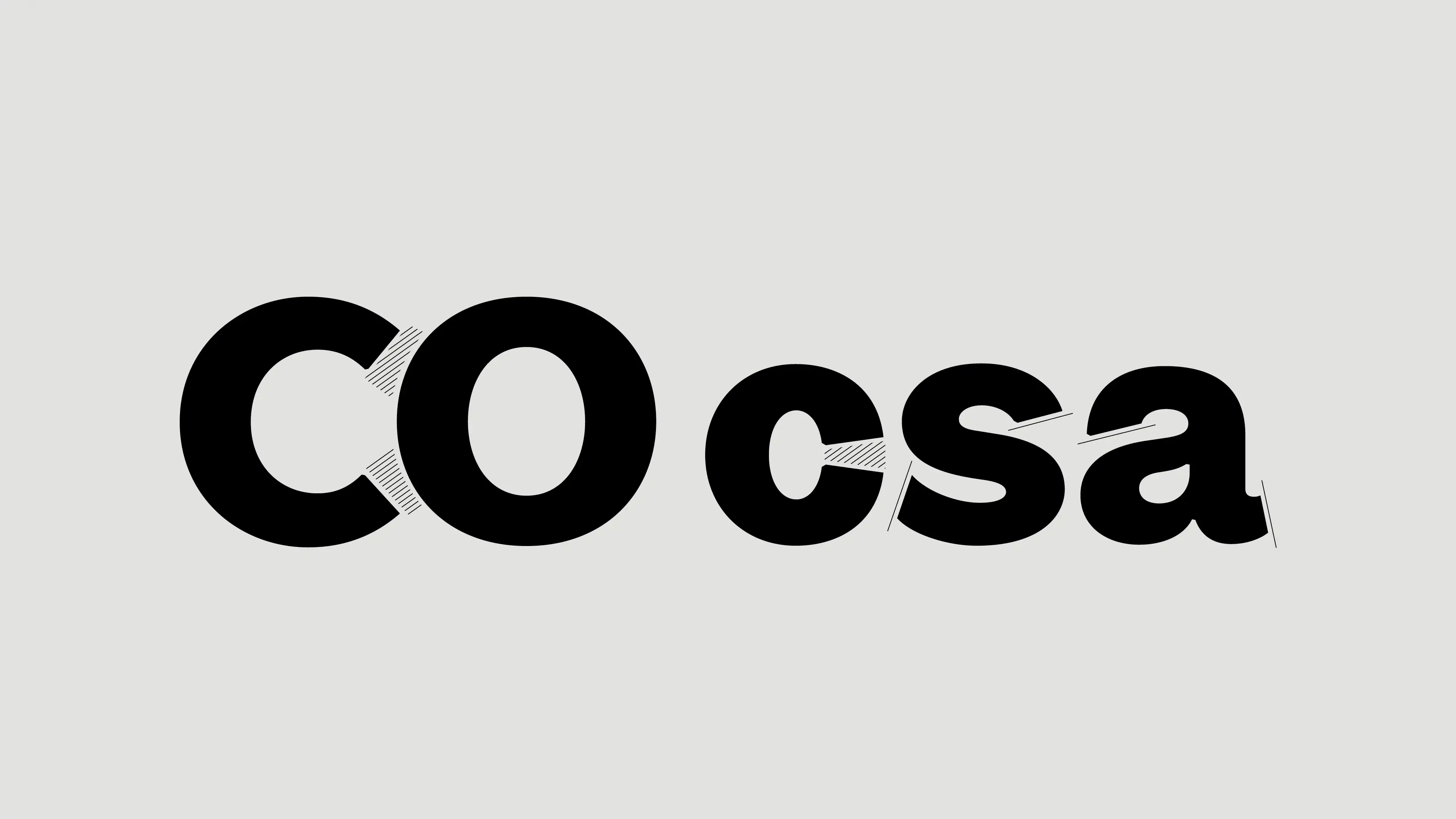
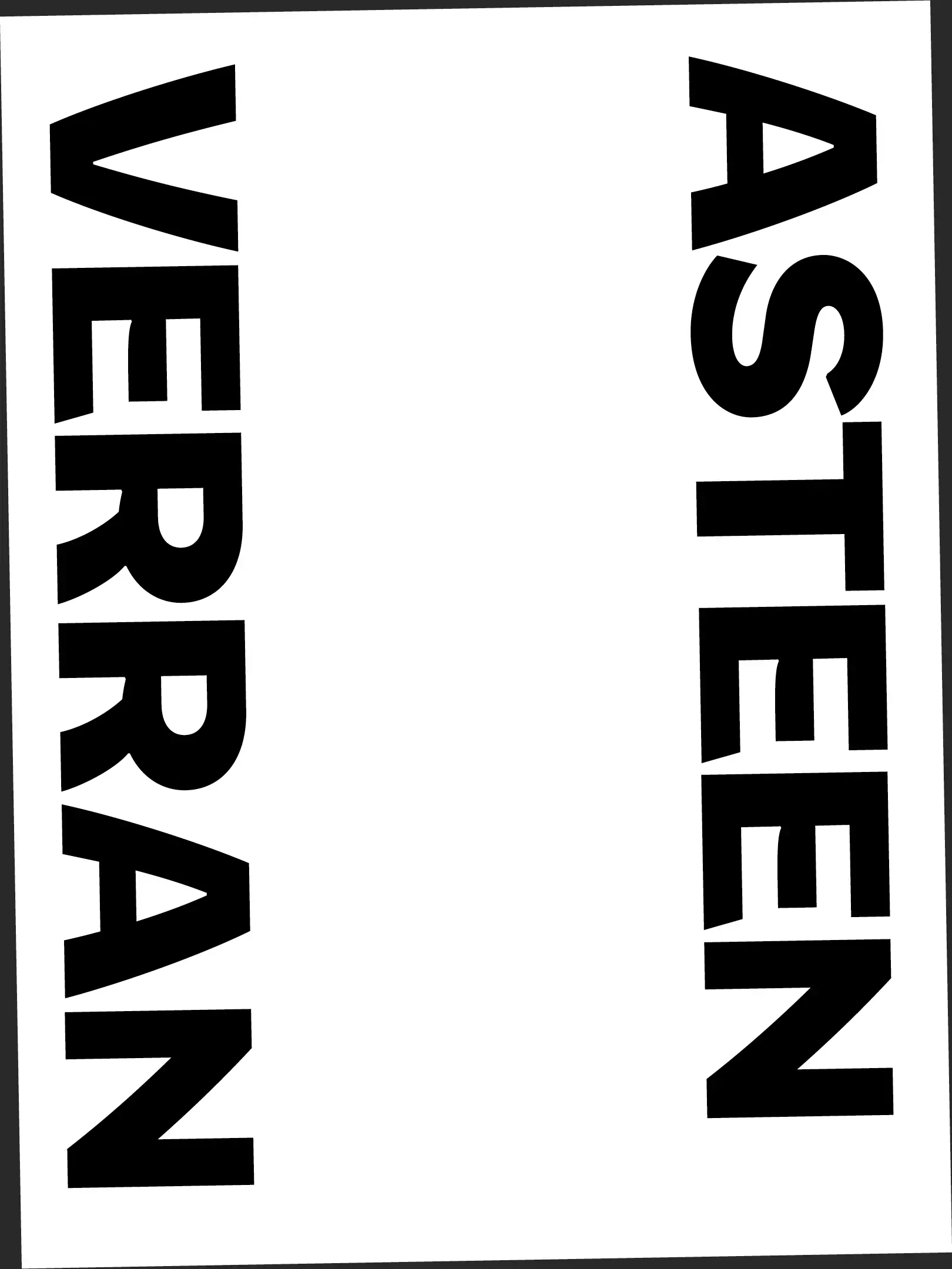
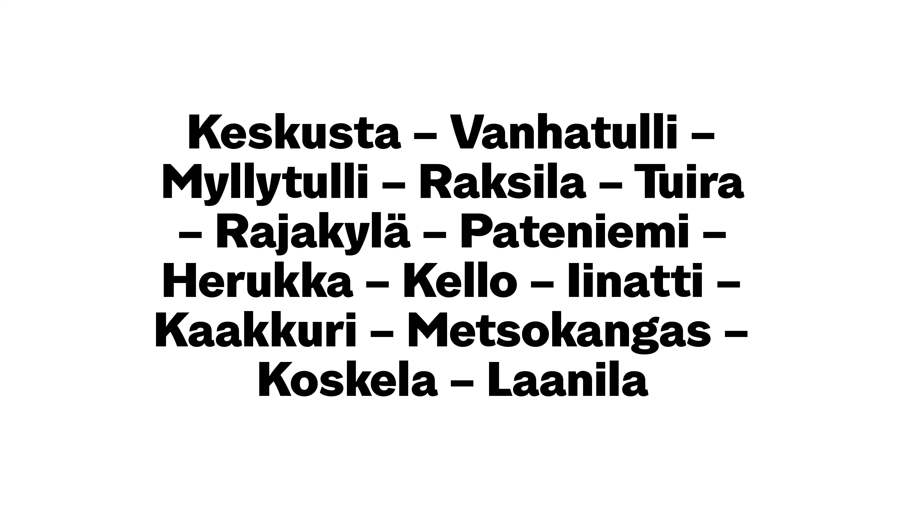
We designed symbols that connect people, carrying messages from north to south and east to west. It’s all about making communication feel natural, effortless, and just a little bit more delightful.
We designed symbols that connect people, carrying messages from north to south and east to west. It’s all about making communication feel natural, effortless, and just a little bit more delightful.