
Martela
A leading Finnish furniture and workplace design company, partnered with us and Aivan agency to create the Martela typeface. Designed to reflect Martela’s fresh and functional approach, it combines industrial precision with a sympathetic touch, balancing hard details with a soft appearance in text. The typeface includes two styles: Martela Sans, with regular and bold cuts, and Martela Sans Mono, which adds a rhythmic contrast to the system.
Type Design
Niklas Ekholm, Jaakko Suomalainen
Niklas Ekholm, Jaakko Suomalainen
Branding Agency
Aivan
Aivan
Client
Martela
Martela
Photography
Courtesy of Martela
Courtesy of Martela

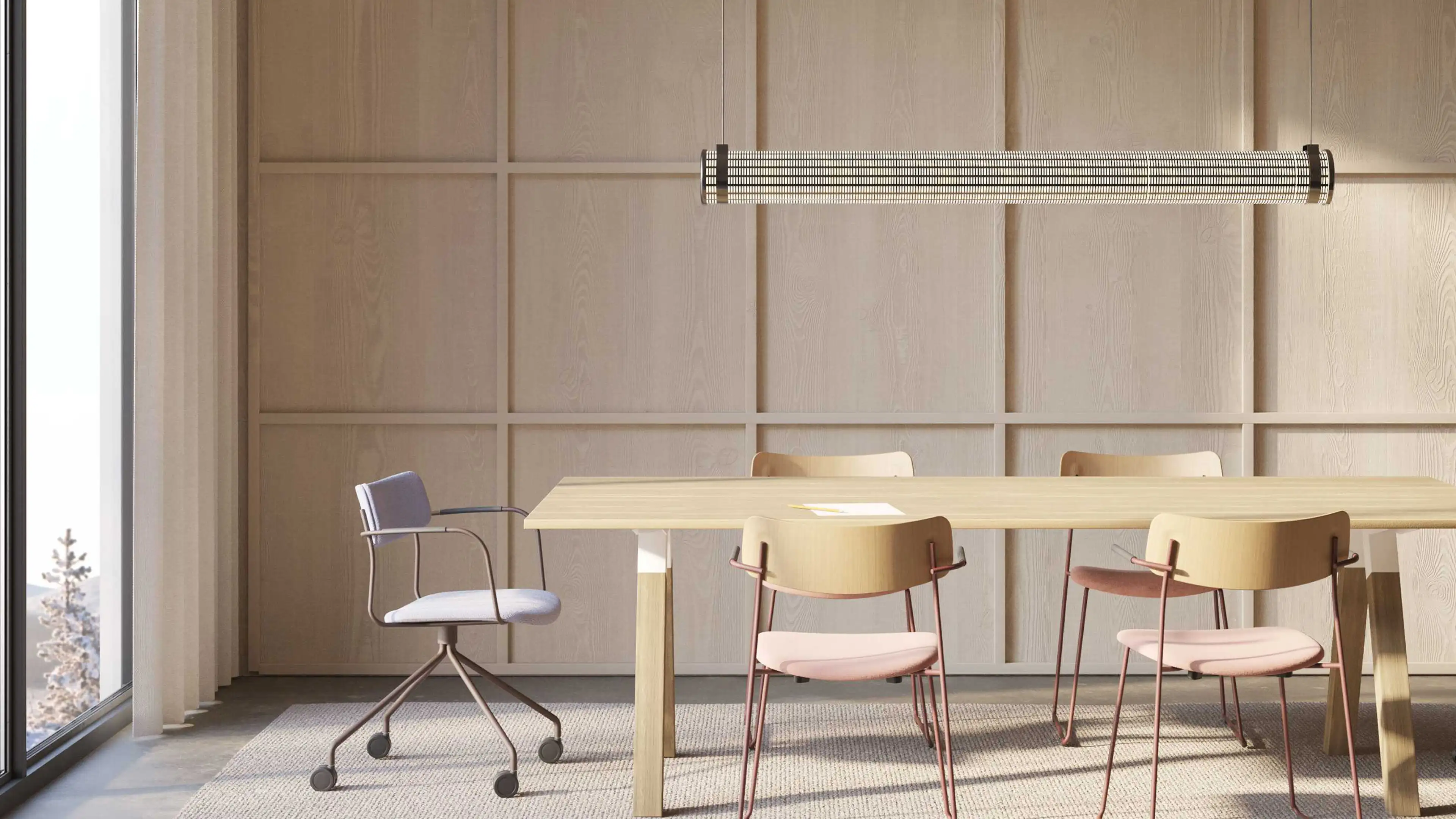
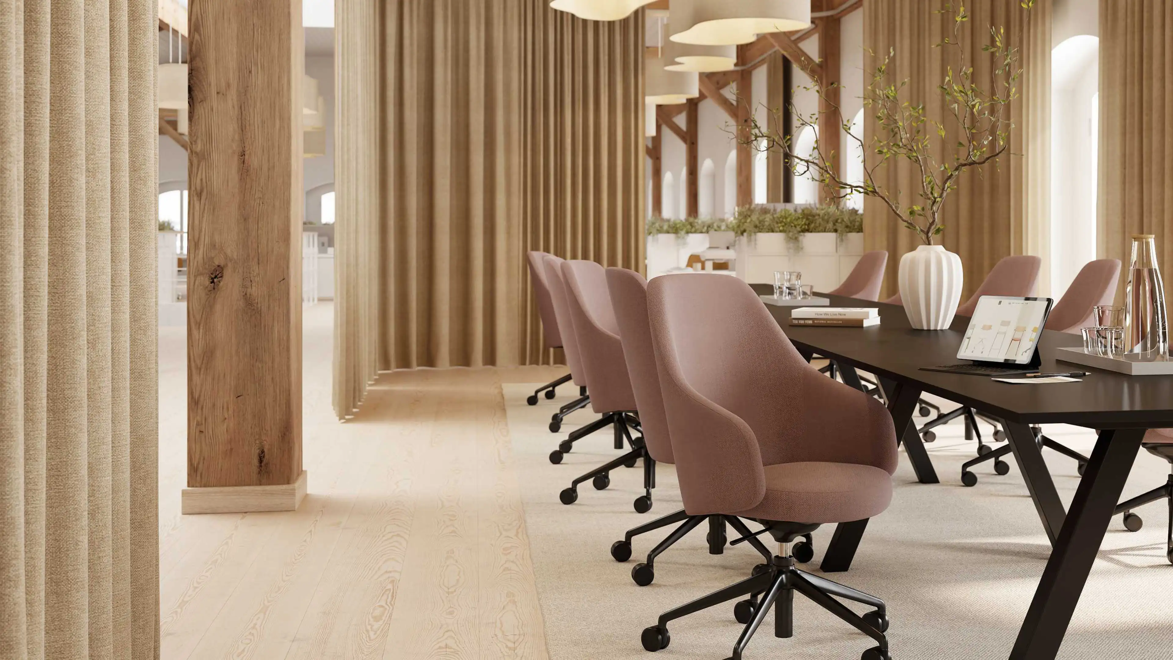
Martela’s environments are shaped by clarity, comfort, and purpose — qualities we mirrored in the structure of the typeface. The forms are solid and balanced, with proportions that favour legibility and structure. Corners are subtly beveled, softening the geometry without undermining its presence. This detail reflects Martela’s tactile approach to industrial design, where every surface is carefully considered. While the shapes appear machined and measured, the overall impression is warm and human. It’s a typeface made for spaces that invite you in — efficient, but never cold.

The type system includes Martela Sans in Regular and Bold weights, alongside Martela Sans Mono — a monospaced companion that introduces a steady rhythm. The Regular weight is tuned for everyday usability: clear in small sizes, flexible across formats. The Bold adds emphasis without tipping into aggression, perfect for navigational elements and headers. Martela Sans Mono introduces rigidity by way of rhythm — every character sits within its own box, adding contrast and mechanical order. Despite the structural constraint, the Mono maintains the same beveled personality, connecting the family across all applications.


Like Martela’s interiors, the typeface supports focus, flow, and simplicity. It’s designed for real-world use — from digital interfaces to signage and product documentation — where clarity and quiet character matter most. The tone is confident but calm, with just enough personality to make it recognisably Martela. Sustainability and long-term use informed every decision: no excess weight, no unnecessary tricks, just a clean, adaptable tool built to last. In the same way Martela furniture supports changing work environments, the typeface adapts to context — scaling from headline to footnote while always staying consistent in tone.

